Convergence Zone Cellars
Weather change.
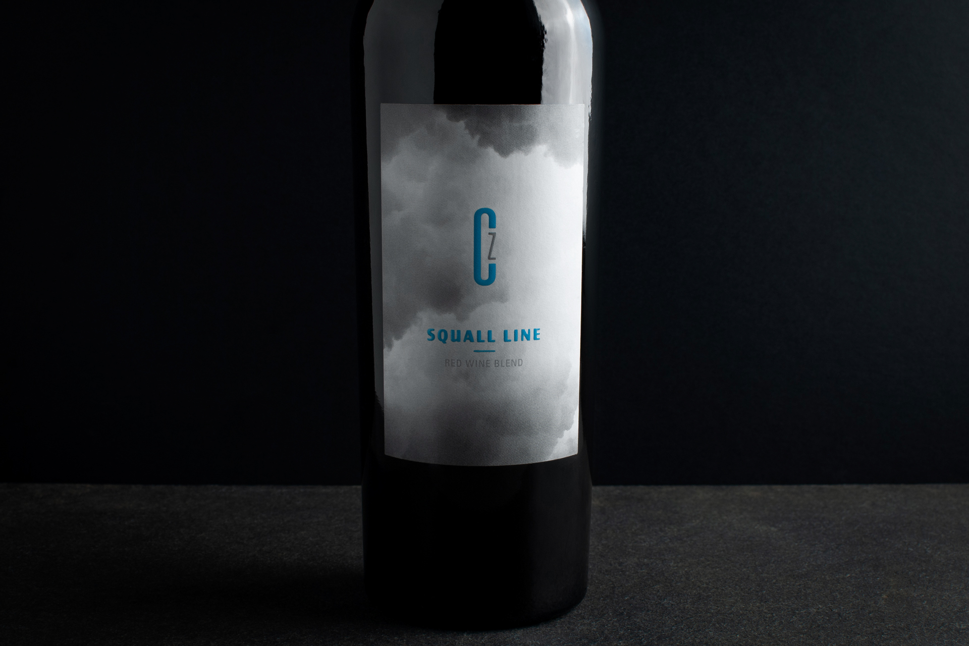
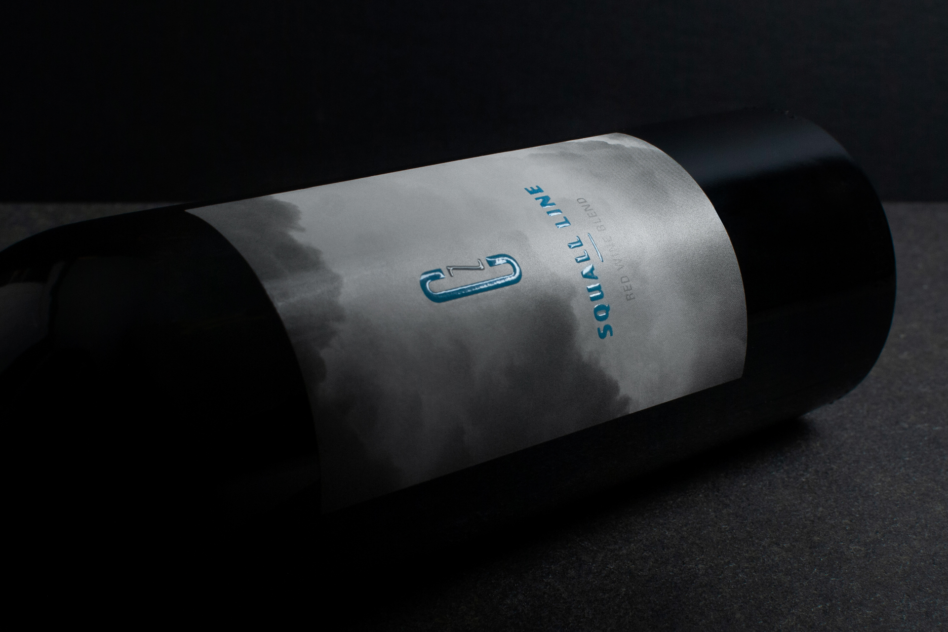
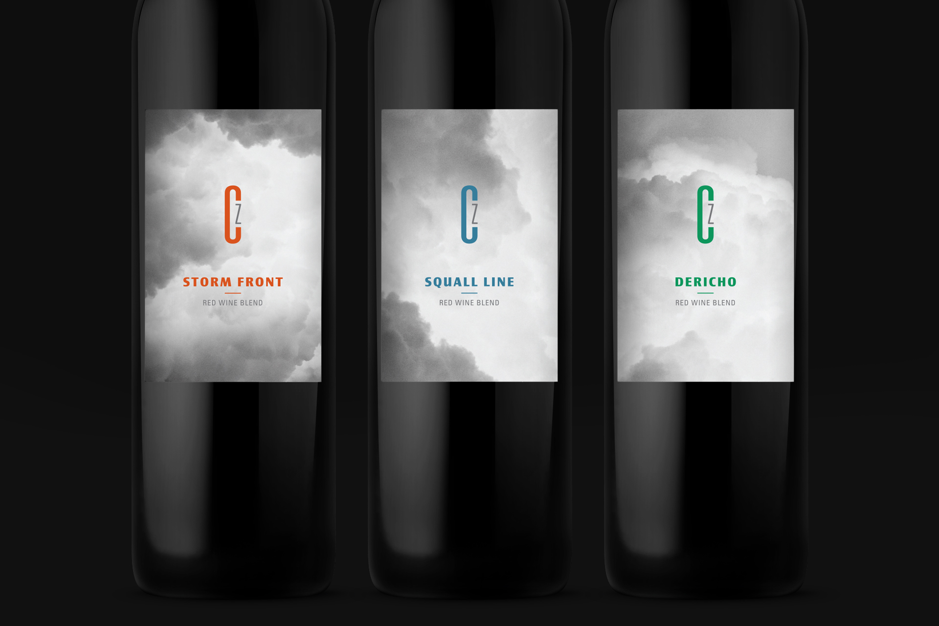
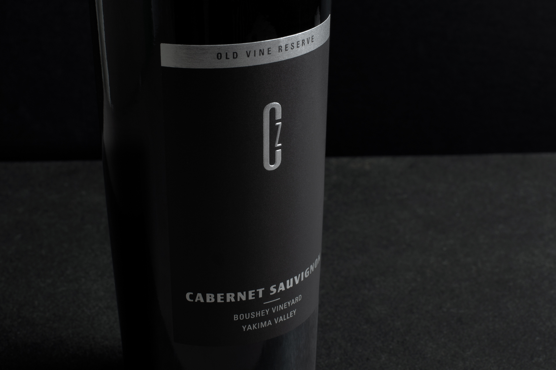
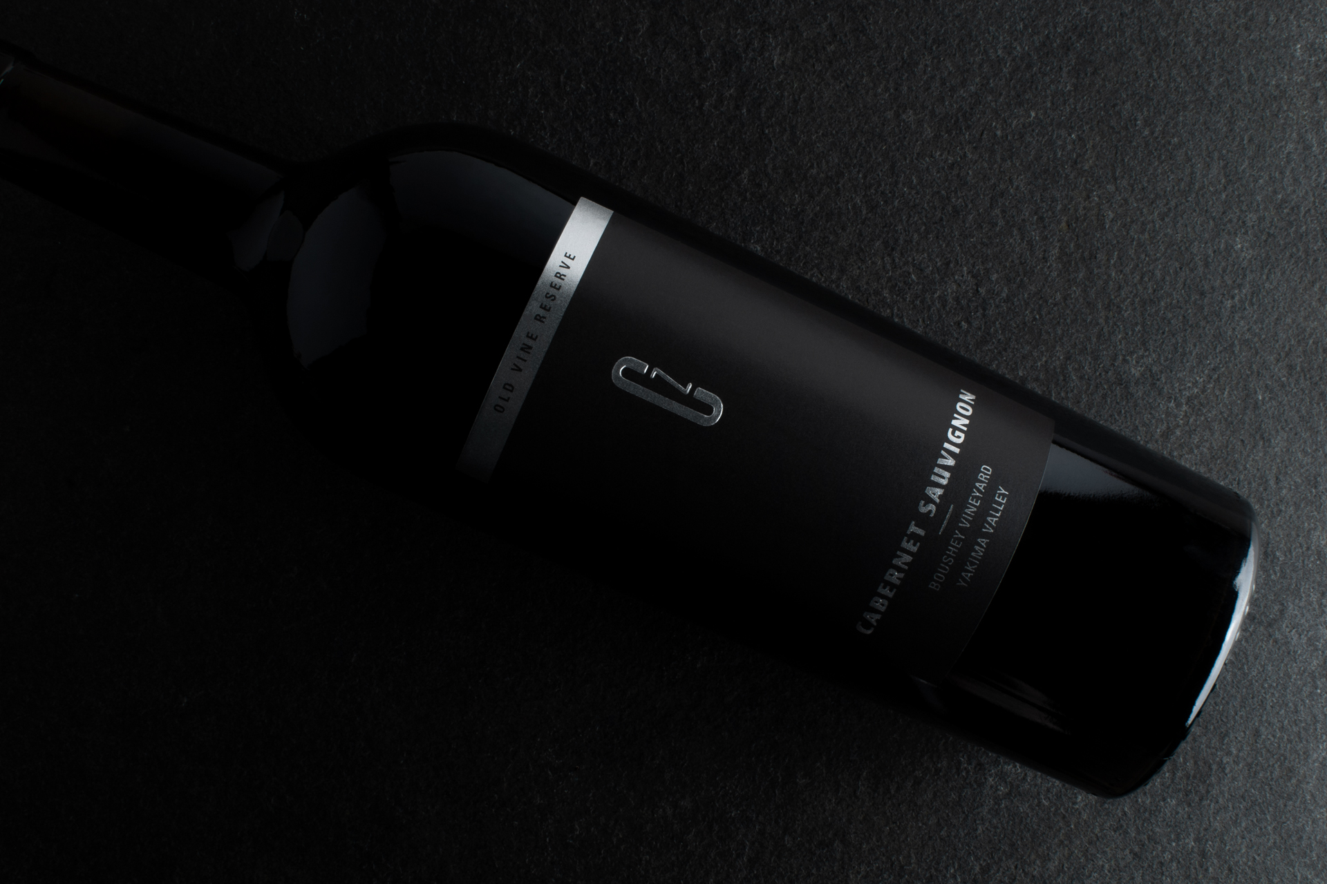
What started as developing marketing materials for Convergence Zone evolved into a full brand refresh solving both economical and functional challenges for this North Bend winery. The biggest change on this refreshing effort was moving away from direct printed bottles to a traditional paper label. The production cost savings are substantial but so is the opportunity for storytelling and faster product releases.
Refreshing the brand started with creating context to their name. Smokey clouds, gray skies, ever changing weather – the brand visuals had to provoke this sense of place. The label system captures moments of a rolling storm creating snapshots of time for each wine. The moody grays are contrasted with saturated product colors reminiscent of outerwear-cladded hikers on a mountain trail. High build varnishes were used for extra dimension and pop over the matte paper labels.
WHAT I DID
Brand Refresh – Label Redesign – System Design