Yakima Chief Hops
Establishing hops leadership without using green.
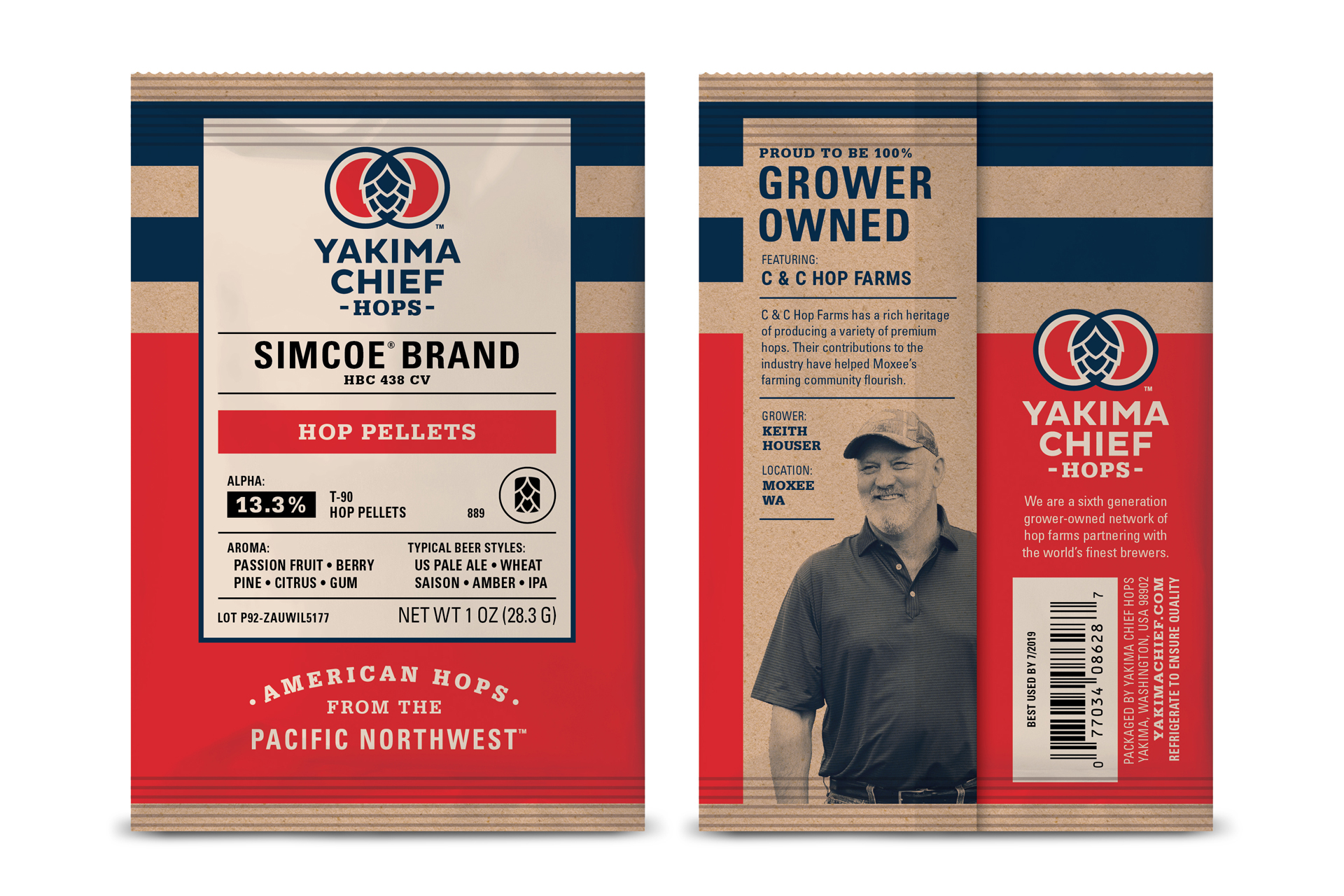
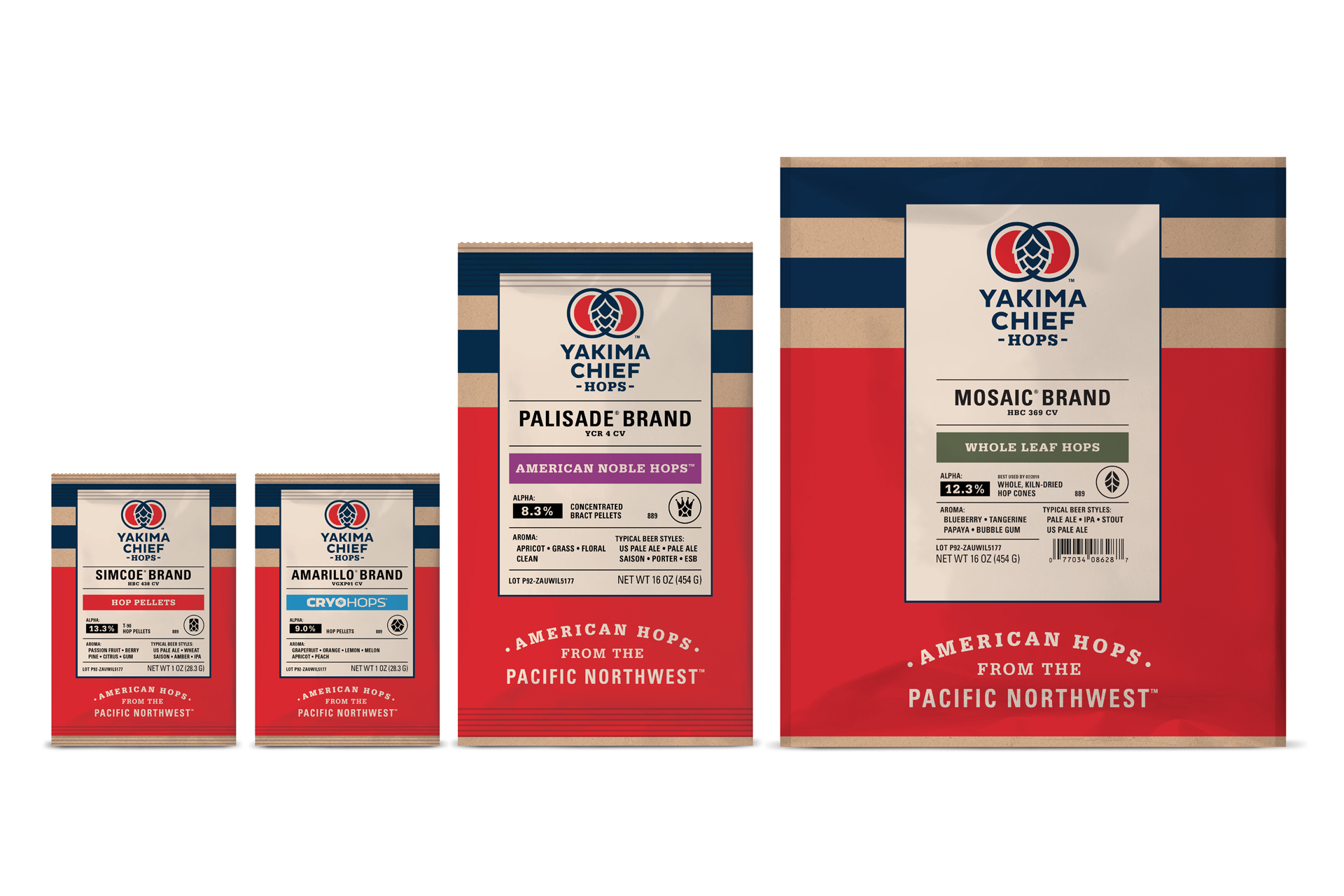
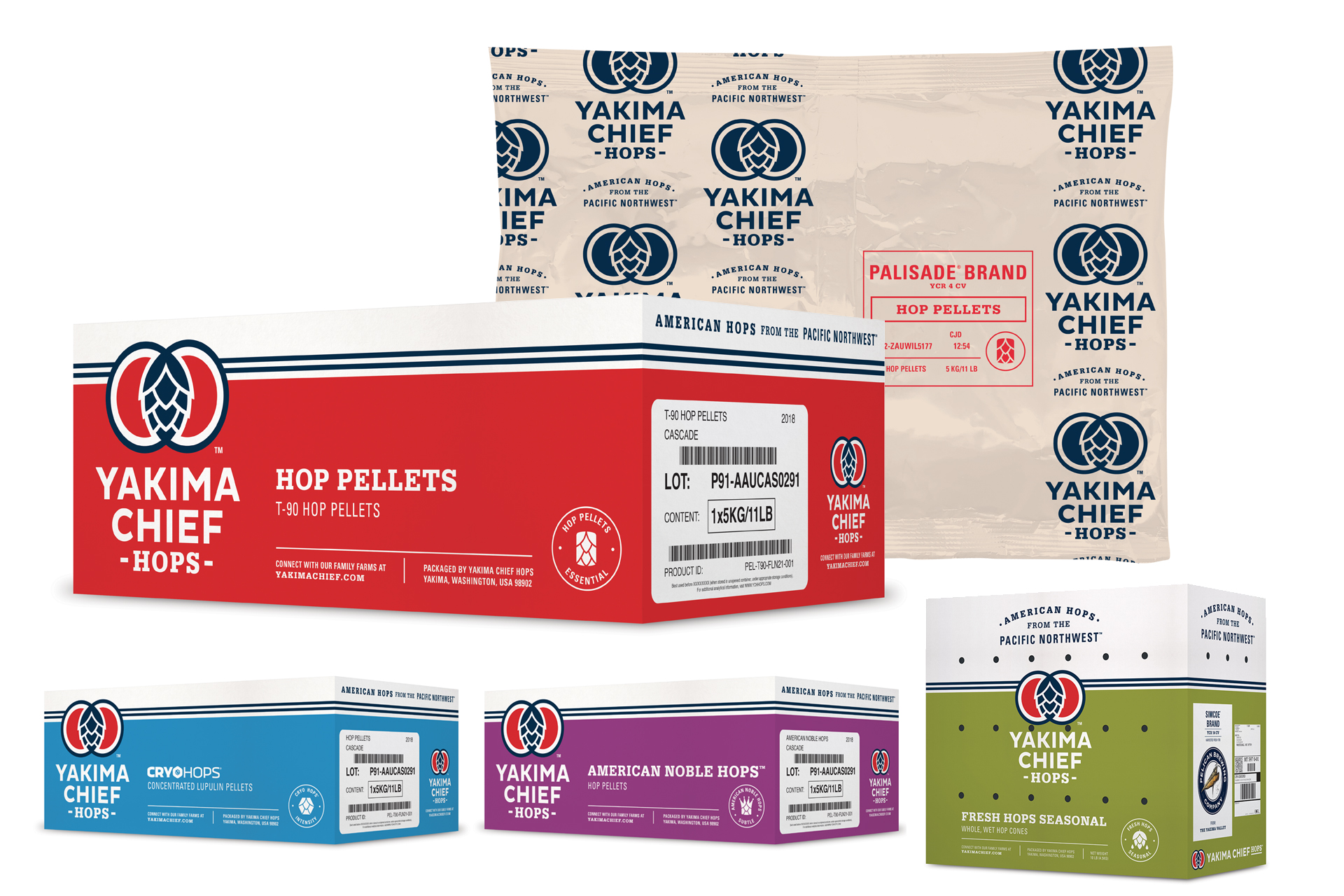
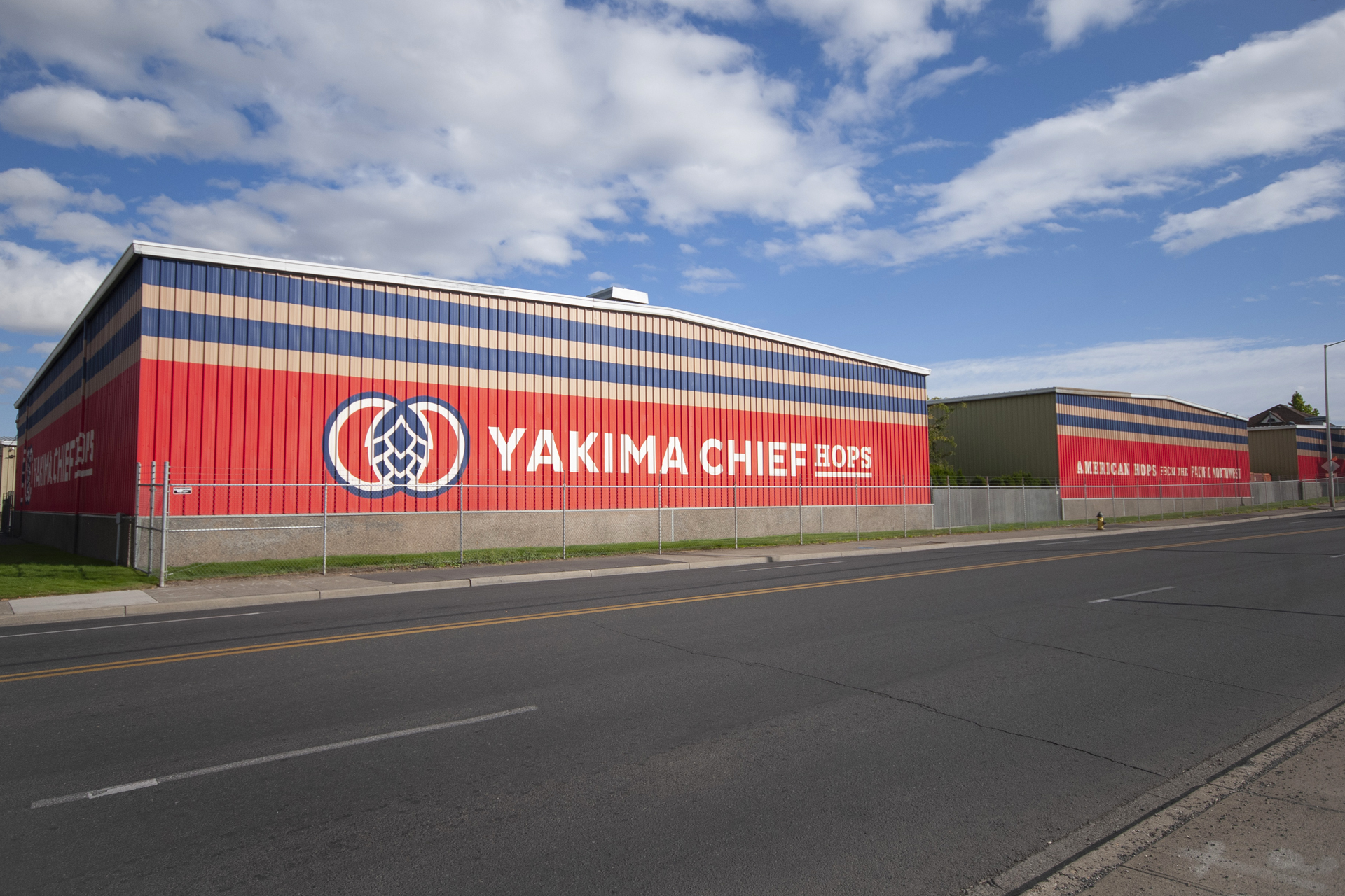
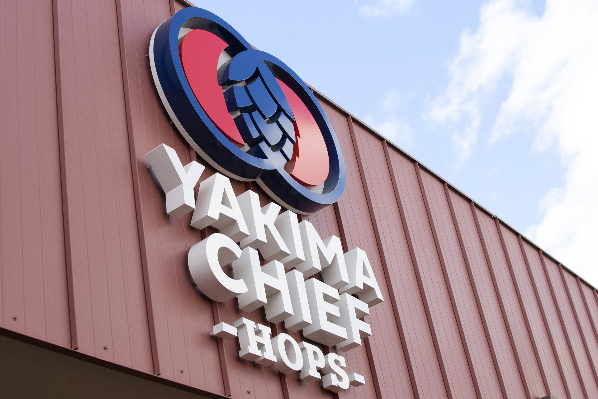
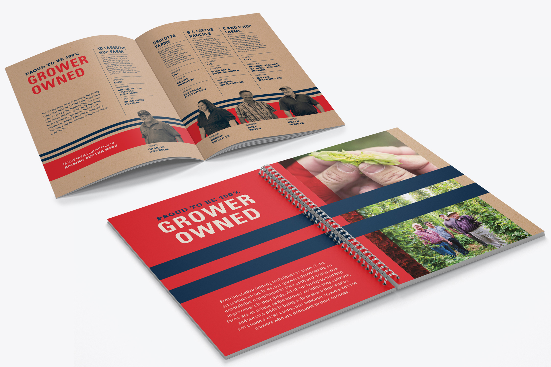
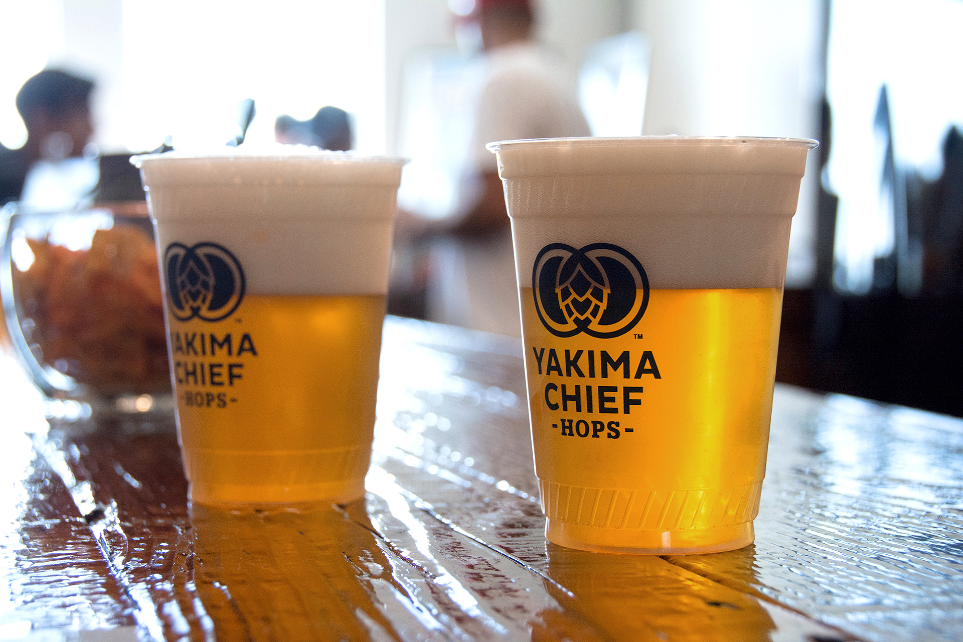
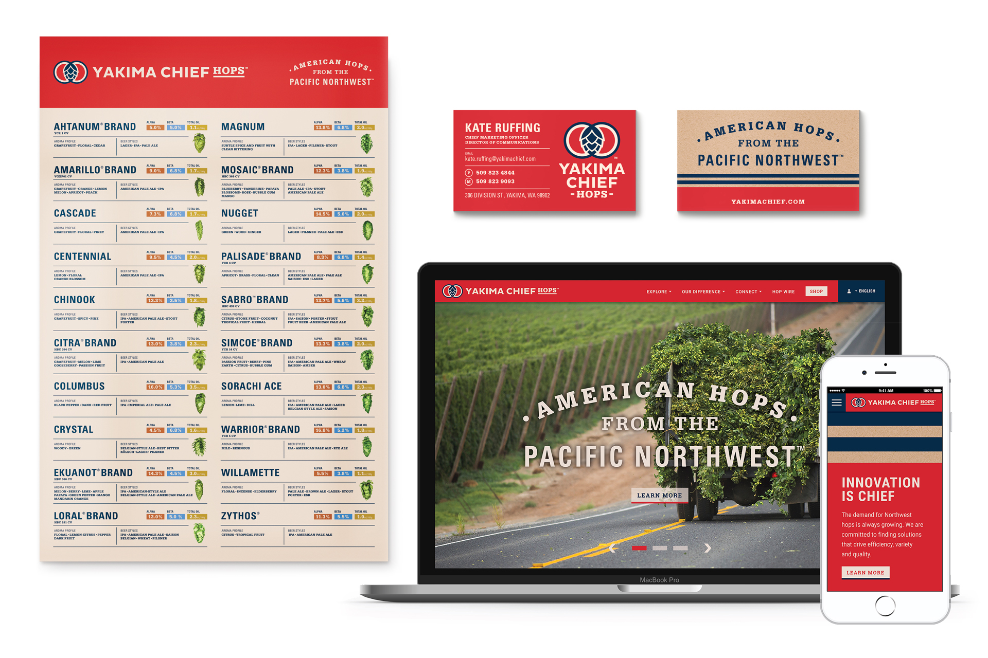
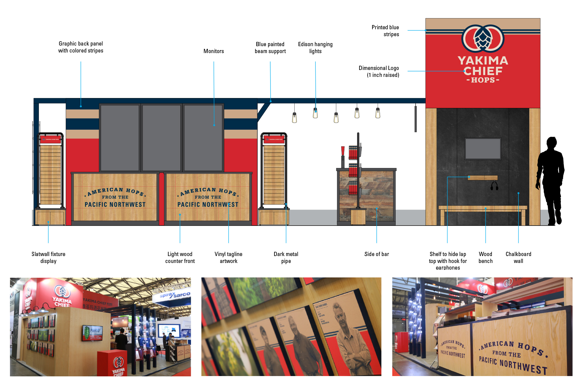
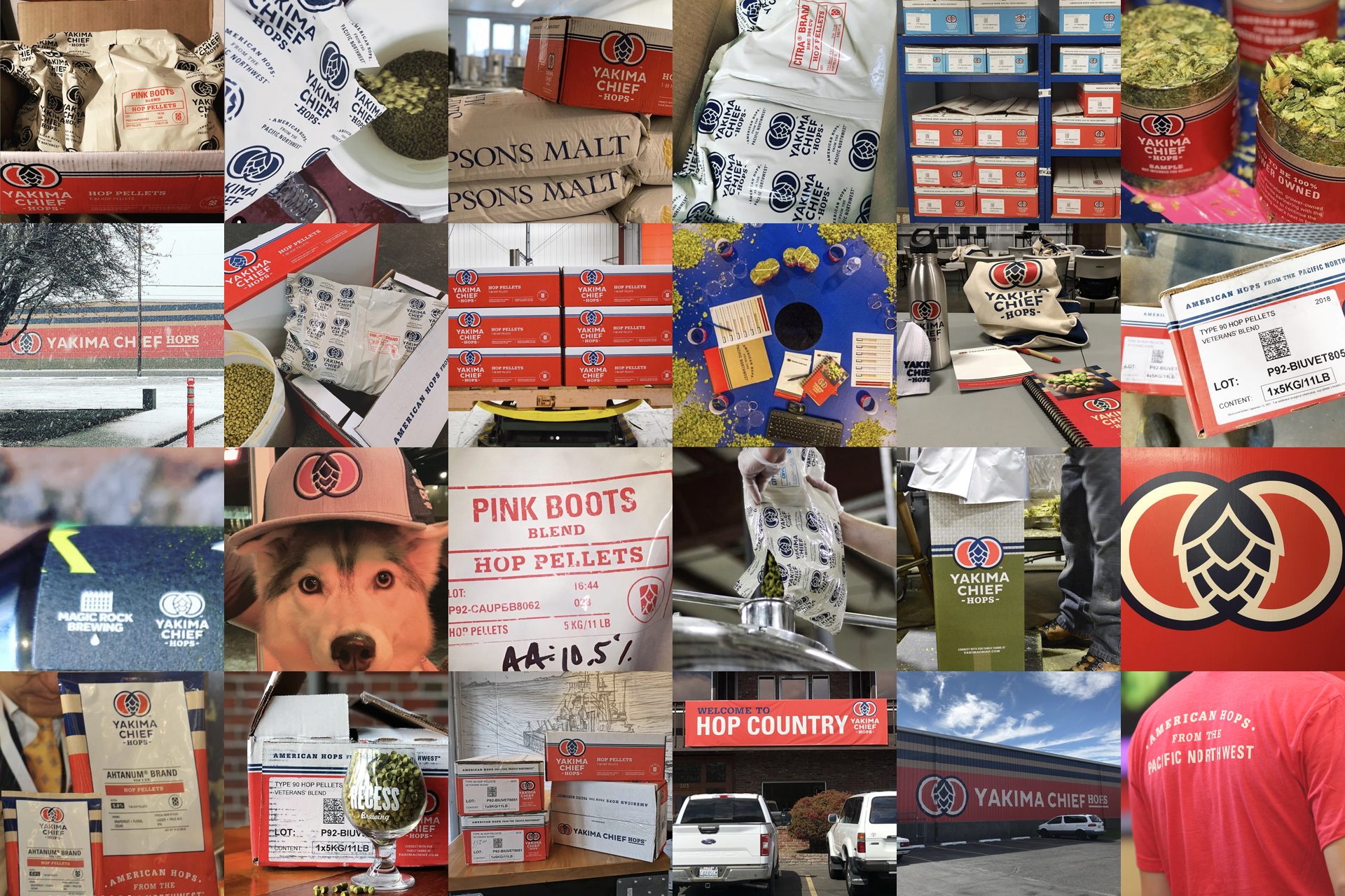
30-years of history connecting family hop farms to the world’s finest brewers, heritage was celebrated naming the company Yakima Chief Hops and developing a new identity to push the brand to become a global leader for hops. Studying the market and seeing an opportunity for differentiation, a new logo was developed celebrating the American heritage of Yakima Chief Hops and it’s relationship with the Yakima Nation. The logo represents the past, present, and future of the organization with strong American heritage aesthetics connecting you to farming and craftsmanship. A navigable packaging design system was developed to work in-line with their machinery across multiple formats and products. Farmers were turned into heroes with heavy uses of portrait photography on packaging and across all materials. Sales materials, advertising, trade show experiences, signage, and websites were developed to complete total brand activation.
WHAT I DID
Brand Identity – Package Design – System Design – Brand Activation – Brand Guide – Signage – Trade Show
Retail Voodoo